

One of the most common questions bloggers and content writers ask is, “What is the best article font size?” It may seem like a small design choice, but font size has a direct impact on how comfortable your content is to read.
A well-written article can still perform poorly if the text is too small, too large, or difficult to scan. Visitors usually decide within a few seconds whether they want to continue reading. If the font feels uncomfortable, many of them simply leave the page.
Whether you’re using WordPress, Blogger, or building your own website, choosing the right article font size improves readability, creates a better user experience, and encourages visitors to spend more time on your content.
In this guide, you’ll learn the ideal font sizes for blog posts, headings, mobile devices, and desktop screens, along with practical tips for creating articles that are easy to read.
Does Article Font Size Affect SEO?
A common misconception is that Google ranks websites based on font size alone.
The answer is no.
Google doesn’t rank a page higher just because you’re using an 18px or 20px font.
However, article font size indirectly affects SEO.
When your content is easy to read:
- Visitors stay longer on your page.
- Readers are more likely to finish the article.
- The content becomes easier to scan.
- The overall user experience improves.
These are positive signals that can help your content perform better over time.
Instead of choosing a font size only for search engines, choose one that makes reading comfortable for your audience.
What Is the Best Article Font Size?
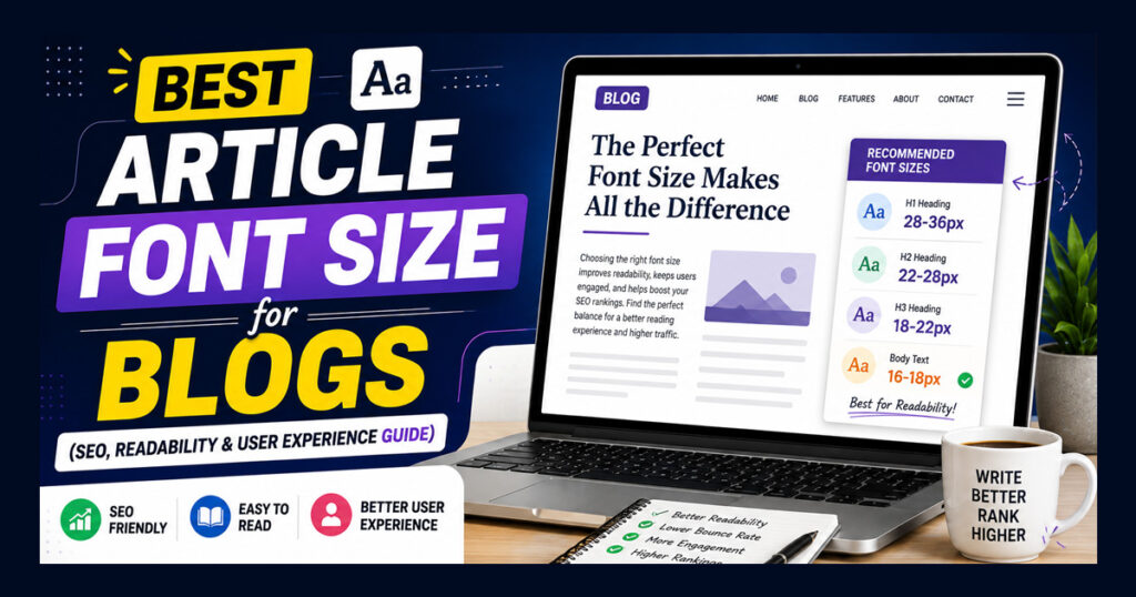
There isn’t one perfect font size that works for every website, but most modern blogs use body text between 16px and 18px.
- 16px works well for compact layouts.
- 17px offers a good balance between readability and content density.
- 18px is often preferred for blogs with long-form articles because it’s easier to read.
If your content regularly exceeds 2,000 words, slightly larger body text often provides a better reading experience.
The goal isn’t to make the text bigger it is to make reading effortless.
Desktop vs Mobile Font Size
Many bloggers design their articles on a desktop computer but forget to check how the content looks on mobile devices.
Since a large percentage of readers now browse on smartphones, your article should remain comfortable to read on smaller screens.
Instead of using different font sizes manually, choose a responsive theme that automatically adjusts typography based on screen size.
Before publishing any article, open it on your phone and read a few paragraphs. If you have to zoom in or the text feels crowded, it’s worth adjusting the typography.
Is Bigger Always Better?
Not necessarily.
Very large text can make an article feel unprofessional and increase scrolling, while very small text can make reading tiring.
The best article font size is one that feels natural after reading several paragraphs.
Your readers shouldn’t notice the typography they should focus entirely on the content.
Best Fonts for Blog Articles
Choosing the right article font size is important, but the font itself also affects readability. A clean and simple font helps readers stay focused on your content without unnecessary distractions.
The image below includes six of the most popular fonts used in blogs:
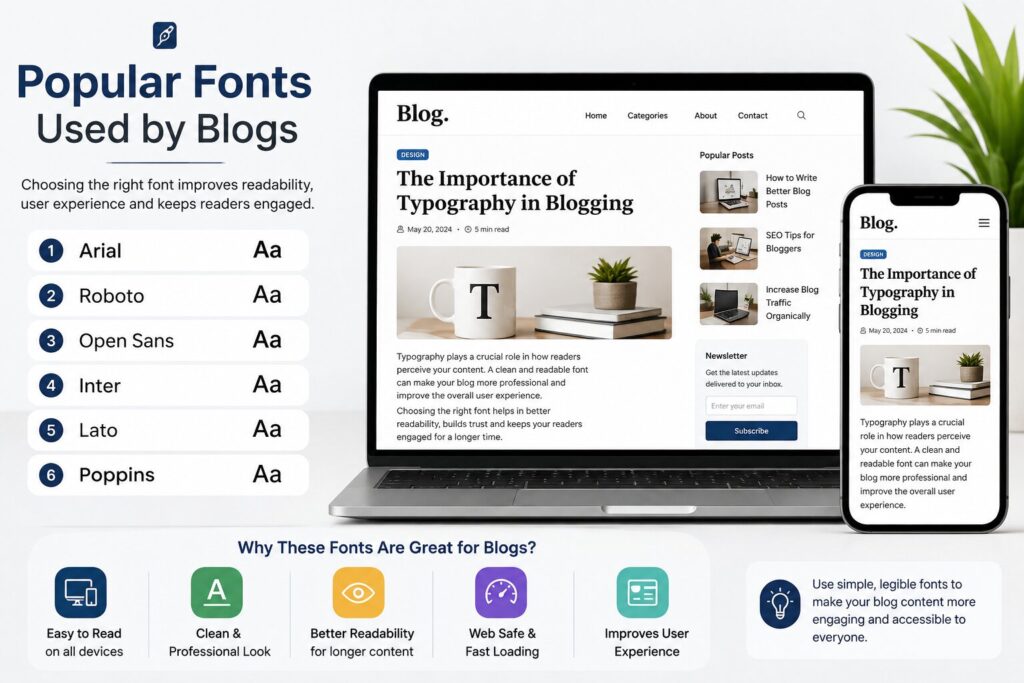
These fonts are easy to read on both desktop and mobile devices.
Instead of using decorative or stylish fonts for your article body, keep them for logos or headings only. A clean font gives your content a more professional appearance and improves the overall reading experience.
Line Height Is Just as Important
Many bloggers focus only on font size and completely ignore line spacing.
Even if you’re using the perfect font size, very little space between lines can make long articles difficult to read.
For most blog posts, a line height between 1.6 and 1.8 works well. It gives enough breathing space between lines and makes paragraphs feel more comfortable.
Example:
body{
    font-size:17px;
    line-height:1.7;
}
A small change like this can make long articles much easier to read.
Keep Paragraphs Short
Large blocks of text often discourage readers, especially on mobile devices.
Instead of writing one long paragraph, break your content into smaller sections.
A good paragraph usually contains 2–4 sentences before moving to the next idea.
Short paragraphs make it easier for readers to scan the article and quickly find the information they need.
Choose a Comfortable Content Width
Another factor that affects readability is the width of your content area.
If each line is too wide, readers have to move their eyes much farther, making long articles feel tiring.
Most modern blogs keep their content width between 700px and 850px, which provides a comfortable reading experience on larger screens.
If you’re using WordPress, many lightweight themes already follow this approach.
WordPress Typography Tips
If you’re using WordPress, avoid changing the font size for every individual post.
Instead, set your typography globally from your theme settings or customizer. This keeps every article consistent across your website.
Before publishing, always preview your article on both desktop and mobile devices.
Ask yourself:
- Is the text easy to read?
- Do headings clearly separate sections?
- Are paragraphs too long?
- Is there enough spacing between lines?
Small adjustments can make a noticeable difference.
Common Font Size Mistakes Bloggers Make
Many new bloggers make common font size and typography mistakes that reduce the reading experience. One of the biggest mistakes is using text that is too small, making it difficult for readers to read comfortably.
Some bloggers choose very large fonts, which make articles look unprofessional and force users to scroll more. Using different fonts in the same article can also make the content look messy and inconsistent. Another common mistake is not checking how the text appears on mobile devices, where most people read blogs today.
Long paragraphs without enough spacing can overwhelm readers, and poor color contrast between the text and background makes content harder to read. Avoiding these simple mistakes will make your blog look cleaner, more professional, and easier for visitors to enjoy.
Conclusion
Choosing the right article font size isn’t about following a fixed rule it’s about making your content comfortable to read. A font size between 16px and 18px, combined with a clean font, proper line height, and short paragraphs, creates a better reading experience for most visitors.
If you’re using WordPress or any other blogging platform, focus on consistency rather than constantly changing typography from one article to another. A simple, readable design helps readers stay engaged with your content and makes your blog look more professional.
Remember, great typography doesn’t attract attention to itself it allows your readers to focus entirely on what you’ve written.